
LETTERBOXD
LETTERBOXD
LETTERBOXD
LETTERBOXD
LETTERBOXD
LETTERBOXD
USABILITY REDESIGN
USABILITY REDESIGN
USABILITY REDESIGN
USABILITY REDESIGN
USABILITY REDESIGN
USABILITY REDESIGN
The current action menu on Letterboxd is hard to find, especially for users with visual impairments. This redesign improves visibility by repositioning key actions, increasing contrast, and simplifying the layout to create a more inclusive, user-friendly experience.
The current action menu on Letterboxd is hard to find, especially for users with visual impairments. This redesign improves visibility by repositioning key actions, increasing contrast, and simplifying the layout to create a more inclusive, user-friendly experience.
The current action menu on Letterboxd is hard to find, especially for users with visual impairments. This redesign improves visibility by repositioning key actions, increasing contrast, and simplifying the layout to create a more inclusive, user-friendly experience.
The current action menu on Letterboxd is hard to find, especially for users with visual impairments. This redesign improves visibility by repositioning key actions, increasing contrast, and simplifying the layout to create a more inclusive, user-friendly experience.
The current action menu on Letterboxd is hard to find, especially for users with visual impairments. This redesign improves visibility by repositioning key actions, increasing contrast, and simplifying the layout to create a more inclusive, user-friendly experience.
[ROLE]
[ROLE]
[ROLE]
Designer
Researcher
Designer
Researcher
Designer
Researcher
[TIMELINE]
[TIMELINE]
[TIMELINE]
3 Weeks
3 Weeks
3 Weeks
[TOOLS]
[TOOLS]
[TOOLS]
Figma
Figma
Figma
[TEAM]
[TEAM]
[TEAM]
Myself
Myself
Myself
[IDENTIFYING THE PROBLEM]
[IDENTIFYING THE PROBLEM]
[IDENTIFYING THE PROBLEM]
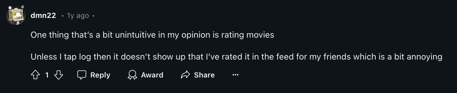
Letterboxd’s current UI hides key logging features, like the review function, in a small pop-up at the bottom of the screen.
Since this pop-up blends into the bottom menu, many users overlook it, making it harder to find and use.
Letterboxd’s current UI hides key logging features, like the review function, in a small pop-up at the bottom of the screen.
Since this pop-up blends into the bottom menu, many users overlook it, making it harder to find and use.
Letterboxd’s current UI hides key logging features, like the review function, in a small pop-up at the bottom of the screen.
Since this pop-up blends into the bottom menu, many users overlook it, making it harder to find and use.
Letterboxd’s current UI hides key logging features, like the review function, in a small pop-up at the bottom of the screen.
Since this pop-up blends into the bottom menu, many users overlook it, making it harder to find and use.
Letterboxd’s current UI hides key logging features, like the review function, in a small pop-up at the bottom of the screen.
Since this pop-up blends into the bottom menu, many users overlook it, making it harder to find and use.
Letterboxd’s current UI hides key logging features, like the review function, in a small pop-up at the bottom of the screen.
Since this pop-up blends into the bottom menu, many users overlook it, making it harder to find and use.

EMPATHIZE
EMPATHIZE
EMPATHIZE
EMPATHIZE
EMPATHIZE
Improving Navigation
Improving Navigation
Improving Navigation
Improving Navigation
Improving Navigation
Improving Navigation
Improving Navigation
While asking frequent users about the app, many of the mentioned assuming the plus button on the bottom menu insinuated where to add a review. This made me explore changing the menu to help users have a smoother and more intuitive experience with the review feature.
While asking frequent users about the app, many of the mentioned assuming the plus button on the bottom menu insinuated where to add a review. This made me explore changing the menu to help users have a smoother and more intuitive experience with the review feature.
While asking frequent users about the app, many of the mentioned assuming the plus button on the bottom menu insinuated where to add a review. This made me explore changing the menu to help users have a smoother and more intuitive experience with the review feature.
While asking frequent users about the app, many of the mentioned assuming the plus button on the bottom menu insinuated where to add a review. This made me explore changing the menu to help users have a smoother and more intuitive experience with the review feature.
While asking frequent users about the app, many of the mentioned assuming the plus button on the bottom menu insinuated where to add a review. This made me explore changing the menu to help users have a smoother and more intuitive experience with the review feature.
While asking frequent users about the app, many of the mentioned assuming the plus button on the bottom menu insinuated where to add a review. This made me explore changing the menu to help users have a smoother and more intuitive experience with the review feature.
While asking frequent users about the app, many of the mentioned assuming the plus button on the bottom menu insinuated where to add a review. This made me explore changing the menu to help users have a smoother and more intuitive experience with the review feature.


With my redesign, key features are no longer hidden
With my redesign, key features are no longer hidden
With my redesign, key features are no longer hidden
With my redesign, key features are no longer hidden
With my redesign, key features are no longer hidden
With my redesign, key features are no longer hidden
With my redesign, key features are no longer hidden
Key features are no longer hidden, making them easier to find and use, improving overall accessibility. Structured the features in a clear, separated layout, making it easier for users to quickly navigate and distinguish between actions.
I integrated Larger touch targets and clearer positioning enhance accessibility, especially for users with visual impairments or limited dexterity.
[CHALLENGE STATEMENT]
[CHALLENGE STATEMENT]
[CHALLENGE STATEMENT]
[CHALLENGE STATEMENT]
[CHALLENGE STATEMENT]
[CHALLENGE STATEMENT]
How might we redesign the action menu on Letterboxd to enhance visibility and accessibility, ensuring that users—especially those with visual impairments—can easily find and utilize key features like rating, logging, reviewing, and organizing films?
How might we redesign the action menu on Letterboxd to enhance visibility and accessibility, ensuring that users—especially those with visual impairments—can easily find and utilize key features like rating, logging, reviewing, and organizing films?
How might we redesign the action menu on Letterboxd to enhance visibility and accessibility, ensuring that users—especially those with visual impairments—can easily find and utilize key features like rating, logging, reviewing, and organizing films?
How might we redesign the action menu on Letterboxd to enhance visibility and accessibility, ensuring that users—especially those with visual impairments—can easily find and utilize key features like rating, logging, reviewing, and organizing films?
How might we redesign the action menu on Letterboxd to enhance visibility and accessibility, ensuring that users—especially those with visual impairments—can easily find and utilize key features like rating, logging, reviewing, and organizing films?
How might we redesign the action menu on Letterboxd to enhance visibility and accessibility, ensuring that users—especially those with visual impairments—can easily find and utilize key features like rating, logging, reviewing, and organizing films?
How might we redesign the action menu on Letterboxd to enhance visibility and accessibility, ensuring that users—especially those with visual impairments—can easily find and utilize key features like rating, logging, reviewing, and organizing films?
[KWHL CHART]
[KWHL CHART]
[KWHL CHART]
[KWHL CHART]
[KWHL CHART]
[KWHL CHART]
[KWHL CHART]
Identifying Key Usability Challenges
Identifying Key Usability Challenges
Identifying Key Usability Challenges
Identifying Key Usability Challenges
Identifying Key Usability Challenges
Identifying Key Usability Challenges
Identifying Key Usability Challenges
The KWHL chart was a critical part of the empathy stage, helping me structure my understanding of the problem and frame my research approach effectively.
I identified that the log and review features were hidden in a compact, hard-to-notice pop-up, with small text and low contrast causing accessibility challenges. This led me to question how UI changes could improve usability and accommodate diverse user needs.

[POEMS OBSERVATION]
[POEMS OBSERVATION]
[POEMS OBSERVATION]
[POEMS OBSERVATION]
[POEMS OBSERVATION]
[POEMS OBSERVATION]
[POEMS OBSERVATION]
Observing users' interactions to identify pain points in real time
Observing users' interactions to identify pain points in real time
Observing users' interactions to identify pain points in real time
Observing users' interactions to identify pain points in real time
Observing users' interactions to identify pain points in real time
Observing users' interactions to identify pain points in real time
Observing users' interactions to identify pain points in real time
PEOPLE
PEOPLE
PEOPLE
PEOPLE
Users with poor vision and short attention spans struggle to find key actions like logging movies.
Cognitive disabilities add to the difficulty due to the lack of options catering to their needs.
Users with poor vision and short attention spans struggle to find key actions like logging movies.
Cognitive disabilities add to the difficulty due to the lack of options catering to their needs.
Users with poor vision and short attention spans struggle to find key actions like logging movies.
Cognitive disabilities add to the difficulty due to the lack of options catering to their needs.
Users with poor vision and short attention spans struggle to find key actions like logging movies.
Cognitive disabilities add to the difficulty due to the lack of options catering to their needs.
Users with poor vision and short attention spans struggle to find key actions like logging movies.
Cognitive disabilities add to the difficulty due to the lack of options catering to their needs.
Users with poor vision and short attention spans struggle to find key actions like logging movies.
Cognitive disabilities add to the difficulty due to the lack of options catering to their needs.
Users with poor vision and short attention spans struggle to find key actions like logging movies.
Cognitive disabilities add to the difficulty due to the lack of options catering to their needs.
OBJECTS
OBJECTS
OBJECTS
OBJECTS
The design does not support easier navigation for users with visual or cognitive challenges.
The design does not support easier navigation for users with visual or cognitive challenges.
The design does not support easier navigation for users with visual or cognitive challenges.
The design does not support easier navigation for users with visual or cognitive challenges.
The design does not support easier navigation for users with visual or cognitive challenges.
The design does not support easier navigation for users with visual or cognitive challenges.
The design does not support easier navigation for users with visual or cognitive challenges.
ENVIRONMENTS
ENVIRONMENTS
ENVIRONMENTS
ENVIRONMENTS
The interface is hard to use in noisy or distracting environments.
Inconsistent design across platforms (web, mobile) adds confusion, especially for users who switch between devices.
The interface is hard to use in noisy or distracting environments.
Inconsistent design across platforms (web, mobile) adds confusion, especially for users who switch between devices.
The interface is hard to use in noisy or distracting environments.
Inconsistent design across platforms (web, mobile) adds confusion, especially for users who switch between devices.
The interface is hard to use in noisy or distracting environments.
Inconsistent design across platforms (web, mobile) adds confusion, especially for users who switch between devices.
The interface is hard to use in noisy or distracting environments.
Inconsistent design across platforms (web, mobile) adds confusion, especially for users who switch between devices.
The interface is hard to use in noisy or distracting environments.
Inconsistent design across platforms (web, mobile) adds confusion, especially for users who switch between devices.
The interface is hard to use in noisy or distracting environments.
Inconsistent design across platforms (web, mobile) adds confusion, especially for users who switch between devices.
MESSAGES
MESSAGES
MESSAGES
MESSAGES
Little to no feedback on key actions (e.g., logging or reviewing), leaving users frustrated.
Little to no feedback on key actions (e.g., logging or reviewing), leaving users frustrated.
Little to no feedback on key actions (e.g., logging or reviewing), leaving users frustrated.
Little to no feedback on key actions (e.g., logging or reviewing), leaving users frustrated.
Little to no feedback on key actions (e.g., logging or reviewing), leaving users frustrated.
Little to no feedback on key actions (e.g., logging or reviewing), leaving users frustrated.
Little to no feedback on key actions (e.g., logging or reviewing), leaving users frustrated.
SERVICES
SERVICES
SERVICES
SERVICES
Lacks built-in accessibility tools
Lacks built-in accessibility tools
Lacks built-in accessibility tools
Lacks built-in accessibility tools
Lacks built-in accessibility tools
Lacks built-in accessibility tools
Lacks built-in accessibility tools
[USER REVIEWS]
[USER REVIEWS]
[USER REVIEWS]
[USER REVIEWS]
[USER REVIEWS]
[USER REVIEWS]
[USER REVIEWS]
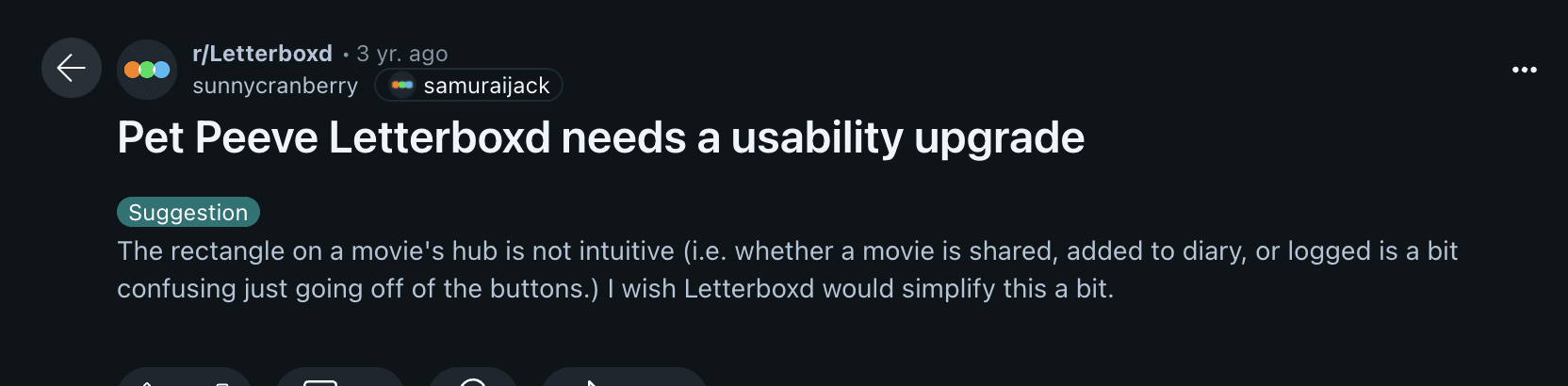
Analyzing user feedback from Reddit reviews to uncover recurring frustrations.
Analyzing user feedback from Reddit reviews to uncover recurring frustrations.
Analyzing user feedback from Reddit reviews to uncover recurring frustrations.
Analyzing user feedback from Reddit reviews to uncover recurring frustrations.
Analyzing user feedback from Reddit reviews to uncover recurring frustrations.
Analyzing user feedback from Reddit reviews to uncover recurring frustrations.
Analyzing user feedback from Reddit reviews to uncover recurring frustrations.
These reviews emphasize the importance of streamlining user interactions, ensuring clear menu options, and considering the needs of users with diverse abilities.
These reviews emphasize the importance of streamlining user interactions, ensuring clear menu options, and considering the needs of users with diverse abilities.
These reviews emphasize the importance of streamlining user interactions, ensuring clear menu options, and considering the needs of users with diverse abilities.
These reviews emphasize the importance of streamlining user interactions, ensuring clear menu options, and considering the needs of users with diverse abilities.
These reviews emphasize the importance of streamlining user interactions, ensuring clear menu options, and considering the needs of users with diverse abilities.
These reviews emphasize the importance of streamlining user interactions, ensuring clear menu options, and considering the needs of users with diverse abilities.
These reviews emphasize the importance of streamlining user interactions, ensuring clear menu options, and considering the needs of users with diverse abilities.

[INTERVIEWS]
[INTERVIEWS]
[INTERVIEWS]
[INTERVIEWS]
[INTERVIEWS]
[INTERVIEWS]
[INTERVIEWS]
Audience insight
Audience insight
Audience insight
Audience insight
Audience insight
Audience insight
Audience insight
Conducting semi-structured interviews with users to gain deeper insights into specific challenges such as ADHD and colour blindness.
Conducting semi-structured interviews with users to gain deeper insights into specific challenges such as ADHD and colour blindness.
Conducting semi-structured interviews with users to gain deeper insights into specific challenges such as ADHD and colour blindness.
Conducting semi-structured interviews with users to gain deeper insights into specific challenges such as ADHD and colour blindness.
Conducting semi-structured interviews with users to gain deeper insights into specific challenges such as ADHD and colour blindness.
Conducting semi-structured interviews with users to gain deeper insights into specific challenges such as ADHD and colour blindness.
Conducting semi-structured interviews with users to gain deeper insights into specific challenges such as ADHD and colour blindness.
Navigation Challenges
Navigation Challenges
Navigation Challenges
Navigation Challenges
Navigation Challenges
Users find the current interface cluttered and unintuitive. Both colorblind and ADHD users struggle to locate key features like the diary and log buttons due to insufficient visual hierarchy and reliance on color cues for differentiation.
Users find the current interface cluttered and unintuitive. Both colorblind and ADHD users struggle to locate key features like the diary and log buttons due to insufficient visual hierarchy and reliance on color cues for differentiation.
Users find the current interface cluttered and unintuitive. Both colorblind and ADHD users struggle to locate key features like the diary and log buttons due to insufficient visual hierarchy and reliance on color cues for differentiation.
Users find the current interface cluttered and unintuitive. Both colorblind and ADHD users struggle to locate key features like the diary and log buttons due to insufficient visual hierarchy and reliance on color cues for differentiation.
Users find the current interface cluttered and unintuitive. Both colorblind and ADHD users struggle to locate key features like the diary and log buttons due to insufficient visual hierarchy and reliance on color cues for differentiation.
Users find the current interface cluttered and unintuitive. Both colorblind and ADHD users struggle to locate key features like the diary and log buttons due to insufficient visual hierarchy and reliance on color cues for differentiation.
Users find the current interface cluttered and unintuitive. Both colorblind and ADHD users struggle to locate key features like the diary and log buttons due to insufficient visual hierarchy and reliance on color cues for differentiation.

Need for Simplified Layout
Need for Simplified Layout
Need for Simplified Layout
Need for Simplified Layout
Need for Simplified Layout
ADHD users emphasize the importance of a clean and minimal interface. Reducing visual distractions and incorporating clear labels and distinct sections can improve focus and usability.
ADHD users emphasize the importance of a clean and minimal interface. Reducing visual distractions and incorporating clear labels and distinct sections can improve focus and usability.
ADHD users emphasize the importance of a clean and minimal interface. Reducing visual distractions and incorporating clear labels and distinct sections can improve focus and usability.
ADHD users emphasize the importance of a clean and minimal interface. Reducing visual distractions and incorporating clear labels and distinct sections can improve focus and usability.
ADHD users emphasize the importance of a clean and minimal interface. Reducing visual distractions and incorporating clear labels and distinct sections can improve focus and usability.
ADHD users emphasize the importance of a clean and minimal interface. Reducing visual distractions and incorporating clear labels and distinct sections can improve focus and usability.
ADHD users emphasize the importance of a clean and minimal interface. Reducing visual distractions and incorporating clear labels and distinct sections can improve focus and usability.
Focus on Labels and Icons
Focus on Labels and Icons
Focus on Labels and Icons
Focus on Labels and Icons
Focus on Labels and Icons
To accommodate colourblind users, the interface should rely on well-designed icons and descriptive text labels rather than colour for conveying information or highlighting features. Clear icons and labels can also help ADHD users quickly identify and navigate to specific functions.
To accommodate colourblind users, the interface should rely on well-designed icons and descriptive text labels rather than colour for conveying information or highlighting features. Clear icons and labels can also help ADHD users quickly identify and navigate to specific functions.
To accommodate colourblind users, the interface should rely on well-designed icons and descriptive text labels rather than colour for conveying information or highlighting features. Clear icons and labels can also help ADHD users quickly identify and navigate to specific functions.
To accommodate colourblind users, the interface should rely on well-designed icons and descriptive text labels rather than colour for conveying information or highlighting features. Clear icons and labels can also help ADHD users quickly identify and navigate to specific functions.
To accommodate colourblind users, the interface should rely on well-designed icons and descriptive text labels rather than colour for conveying information or highlighting features. Clear icons and labels can also help ADHD users quickly identify and navigate to specific functions.
IDEATE
IDEATE
IDEATE
[PERSONAS]
[PERSONAS]
[PERSONAS]
[PERSONAS]
[PERSONAS]
[PERSONAS]
[PERSONAS]
Empathizing with user goals and pain points.
Empathizing with user goals and pain points.
Empathizing with user goals and pain points.
Empathizing with user goals and pain points.
Empathizing with user goals and pain points.
Claire and Denise represent users with accessibility challenges—poor vision and cognitive impairments. Their goals and needs informed the design strategy, guiding a more accessible action menu. These personas were later used to develop user journeys, ensuring a user-friendly experience.
Claire and Denise represent users with accessibility challenges—poor vision and cognitive impairments. Their goals and needs informed the design strategy, guiding a more accessible action menu. These personas were later used to develop user journeys, ensuring a user-friendly experience.
Claire and Denise represent users with accessibility challenges—poor vision and cognitive impairments. Their goals and needs informed the design strategy, guiding a more accessible action menu. These personas were later used to develop user journeys, ensuring a user-friendly experience.
Claire and Denise represent users with accessibility challenges—poor vision and cognitive impairments. Their goals and needs informed the design strategy, guiding a more accessible action menu. These personas were later used to develop user journeys, ensuring a user-friendly experience.
Claire and Denise represent users with accessibility challenges—poor vision and cognitive impairments. Their goals and needs informed the design strategy, guiding a more accessible action menu. These personas were later used to develop user journeys, ensuring a user-friendly experience.
Claire and Denise represent users with accessibility challenges—poor vision and cognitive impairments. Their goals and needs informed the design strategy, guiding a more accessible action menu. These personas were later used to develop user journeys, ensuring a user-friendly experience.
Claire and Denise represent users with accessibility challenges—poor vision and cognitive impairments. Their goals and needs informed the design strategy, guiding a more accessible action menu. These personas were later used to develop user journeys, ensuring a user-friendly experience.


[USER JOURNEY]
[USER JOURNEY]
[USER JOURNEY]
[USER JOURNEY]
[USER JOURNEY]
[USER JOURNEY]
[USER JOURNEY]
Visibility and Navigation for Users with Impairments
Visibility and Navigation for Users with Impairments
Visibility and Navigation for Users with Impairments
Visibility and Navigation for Users with Impairments
Visibility and Navigation for Users with Impairments
Visibility and Navigation for Users with Impairments
Visibility and Navigation for Users with Impairments
These user journeys highlight how Claire and Janice face challenges navigating Letterboxd. Claire struggles with small text, low contrast, and a cluttered layout, while Janice finds the action menu hard to locate. Both scenarios reveal the need for better accessibility through clearer layouts, larger text, and improved navigation.
These user journeys highlight how Claire and Janice face challenges navigating Letterboxd. Claire struggles with small text, low contrast, and a cluttered layout, while Janice finds the action menu hard to locate. Both scenarios reveal the need for better accessibility through clearer layouts, larger text, and improved navigation.
These user journeys highlight how Claire and Janice face challenges navigating Letterboxd. Claire struggles with small text, low contrast, and a cluttered layout, while Janice finds the action menu hard to locate. Both scenarios reveal the need for better accessibility through clearer layouts, larger text, and improved navigation.
These user journeys highlight how Claire and Janice face challenges navigating Letterboxd. Claire struggles with small text, low contrast, and a cluttered layout, while Janice finds the action menu hard to locate. Both scenarios reveal the need for better accessibility through clearer layouts, larger text, and improved navigation.
These user journeys highlight how Claire and Janice face challenges navigating Letterboxd. Claire struggles with small text, low contrast, and a cluttered layout, while Janice finds the action menu hard to locate. Both scenarios reveal the need for better accessibility through clearer layouts, larger text, and improved navigation.
These user journeys highlight how Claire and Janice face challenges navigating Letterboxd. Claire struggles with small text, low contrast, and a cluttered layout, while Janice finds the action menu hard to locate. Both scenarios reveal the need for better accessibility through clearer layouts, larger text, and improved navigation.
These user journeys highlight how Claire and Janice face challenges navigating Letterboxd. Claire struggles with small text, low contrast, and a cluttered layout, while Janice finds the action menu hard to locate. Both scenarios reveal the need for better accessibility through clearer layouts, larger text, and improved navigation.


[DESIGN GOALS]
[DESIGN GOALS]
[DESIGN GOALS]
[DESIGN GOALS]
[DESIGN GOALS]
[DESIGN GOALS]
[DESIGN GOALS]
What do users want?
What do users want?
What do users want?
What do users want?
What do users want?
What do users want?
What do users want?
[WIREFRAMES]
[WIREFRAMES]
[WIREFRAMES]
[WIREFRAMES]
[WIREFRAMES]
[WIREFRAMES]
[WIREFRAMES]
Iterating based on feedback
Iterating based on feedback
Iterating based on feedback
Iterating based on feedback
Iterating based on feedback
Iterating based on feedback
Iterating based on feedback
Throughout the redesign process, I explored multiple iterations to address the usability issues in the original design. Through this iterative process, I was able to evaluate and refine the design systematically, ensuring that each decision addressed a specific pain point while prioritizing user needs.
Throughout the redesign process, I explored multiple iterations to address the usability issues in the original design. Through this iterative process, I was able to evaluate and refine the design systematically, ensuring that each decision addressed a specific pain point while prioritizing user needs.
Throughout the redesign process, I explored multiple iterations to address the usability issues in the original design. Through this iterative process, I was able to evaluate and refine the design systematically, ensuring that each decision addressed a specific pain point while prioritizing user needs.
Throughout the redesign process, I explored multiple iterations to address the usability issues in the original design. Through this iterative process, I was able to evaluate and refine the design systematically, ensuring that each decision addressed a specific pain point while prioritizing user needs.
Throughout the redesign process, I explored multiple iterations to address the usability issues in the original design. Through this iterative process, I was able to evaluate and refine the design systematically, ensuring that each decision addressed a specific pain point while prioritizing user needs.
Throughout the redesign process, I explored multiple iterations to address the usability issues in the original design. Through this iterative process, I was able to evaluate and refine the design systematically, ensuring that each decision addressed a specific pain point while prioritizing user needs.
Throughout the redesign process, I explored multiple iterations to address the usability issues in the original design. Through this iterative process, I was able to evaluate and refine the design systematically, ensuring that each decision addressed a specific pain point while prioritizing user needs.
[STYLE GUIDE]
[STYLE GUIDE]
[STYLE GUIDE]
[STYLE GUIDE]
[STYLE GUIDE]
[STYLE GUIDE]
[STYLE GUIDE]
Bringing it to life
Bringing it to life
Bringing it to life
Bringing it to life
Bringing it to life
Bringing it to life
Bringing it to life

[CONCLUSION]
[CONCLUSION]
[CONCLUSION]
[CONCLUSION]
[CONCLUSION]
[CONCLUSION]
[CONCLUSION]
What I learned about usability
What I learned about usability
What I learned about usability
What I learned about usability
What I learned about usability
What I learned about usability
What I learned about usability
Understanding Accessibility Needs
Understanding Accessibility Needs
Understanding Accessibility Needs
Understanding Accessibility Needs
Understanding Accessibility Needs
Gained insights into the specific challenges faced by users with poor vision and limited attention spans, emphasizing the importance of inclusive design.
Gained insights into the specific challenges faced by users with poor vision and limited attention spans, emphasizing the importance of inclusive design.
Gained insights into the specific challenges faced by users with poor vision and limited attention spans, emphasizing the importance of inclusive design.
Gained insights into the specific challenges faced by users with poor vision and limited attention spans, emphasizing the importance of inclusive design.
Gained insights into the specific challenges faced by users with poor vision and limited attention spans, emphasizing the importance of inclusive design.
Gained insights into the specific challenges faced by users with poor vision and limited attention spans, emphasizing the importance of inclusive design.
Gained insights into the specific challenges faced by users with poor vision and limited attention spans, emphasizing the importance of inclusive design.
Simplifying Navigation:
Simplifying Navigation:
Simplifying Navigation:
Simplifying Navigation:
Simplifying Navigation:
Learned how streamlined navigation can significantly improve usability for diverse user groups, making key actions easier to locate and interact with.
Learned how streamlined navigation can significantly improve usability for diverse user groups, making key actions easier to locate and interact with.
Learned how streamlined navigation can significantly improve usability for diverse user groups, making key actions easier to locate and interact with.
Learned how streamlined navigation can significantly improve usability for diverse user groups, making key actions easier to locate and interact with.
Learned how streamlined navigation can significantly improve usability for diverse user groups, making key actions easier to locate and interact with.
Learned how streamlined navigation can significantly improve usability for diverse user groups, making key actions easier to locate and interact with.
Learned how streamlined navigation can significantly improve usability for diverse user groups, making key actions easier to locate and interact with.
Designing for Visibility
Designing for Visibility
Designing for Visibility
Designing for Visibility
Designing for Visibility
Realized the importance of integrating user feedback into the design process to address real-world accessibility concerns effectively.
Realized the importance of integrating user feedback into the design process to address real-world accessibility concerns effectively.
Realized the importance of integrating user feedback into the design process to address real-world accessibility concerns effectively.
Realized the importance of integrating user feedback into the design process to address real-world accessibility concerns effectively.
Realized the importance of integrating user feedback into the design process to address real-world accessibility concerns effectively.
Realized the importance of integrating user feedback into the design process to address real-world accessibility concerns effectively.
Realized the importance of integrating user feedback into the design process to address real-world accessibility concerns effectively.
Balancing Functionality and Simplicity
Balancing Functionality and Simplicity
Balancing Functionality and Simplicity
Balancing Functionality and Simplicity
Balancing Functionality and Simplicity
Learned how to balance functional complexity with simplicity to ensure the design serves users of varying abilities.
Learned how to balance functional complexity with simplicity to ensure the design serves users of varying abilities.
Learned how to balance functional complexity with simplicity to ensure the design serves users of varying abilities.
Learned how to balance functional complexity with simplicity to ensure the design serves users of varying abilities.
Learned how to balance functional complexity with simplicity to ensure the design serves users of varying abilities.
Learned how to balance functional complexity with simplicity to ensure the design serves users of varying abilities.
Learned how to balance functional complexity with simplicity to ensure the design serves users of varying abilities.
DELIVER
DELIVER
DELIVER
DESIGN
DESIGN
DESIGN
VIEW PROTOTYPE
Try my prototype!
Try my prototype!
Try my prototype!
Try my prototype!
Try my prototype!

Title and description should be placed under each other
Title and description should be placed under each other
Title and description should be placed under each other
Reviews/ log and lists placed too low
Reviews/ log and lists placed too low
Reviews/ log and lists placed too low

Getting rid of the star rating system took away too much from the original ux
Getting rid of the star rating system took away too much from the original ux
Getting rid of the star rating system took away too much from the original ux

Imbalanced with right side only having the overall rating
Imbalanced with right side only having the overall rating
Imbalanced with right side only having the overall rating
Users may want to rate without writing a review and vice versa
Users may want to rate without writing a review and vice versa
Users may want to rate without writing a review and vice versa

Original design has watch, like and watchlist grouped together
Original design has watch, like and watchlist grouped together
Original design has watch, like and watchlist grouped together
“Lack of hierarchy”
“Lack of hierarchy”
“Lack of hierarchy”
“Lack of hierarchy”
Title and description should be placed under each other
Reviews/ log and lists placed too low
Getting rid of the star rating system took away too much from the original ux
Imbalanced with right side only having the overall rating
Users may want to rate without writing a review and vice versa
Original design has watch, like and watchlist grouped together
“Lack of
hierarchy”

VIEW PROTOTYPE
VIEW PROTOTYPE
VIEW PROTOTYPE
VIEW PROTOTYPE